> ## Documentation Index
> Fetch the complete documentation index at: https://discountkit.app/llms.txt
> Use this file to discover all available pages before exploring further.
# Order Goal
> Cart progress bar toward an order-goal discount's spend tiers
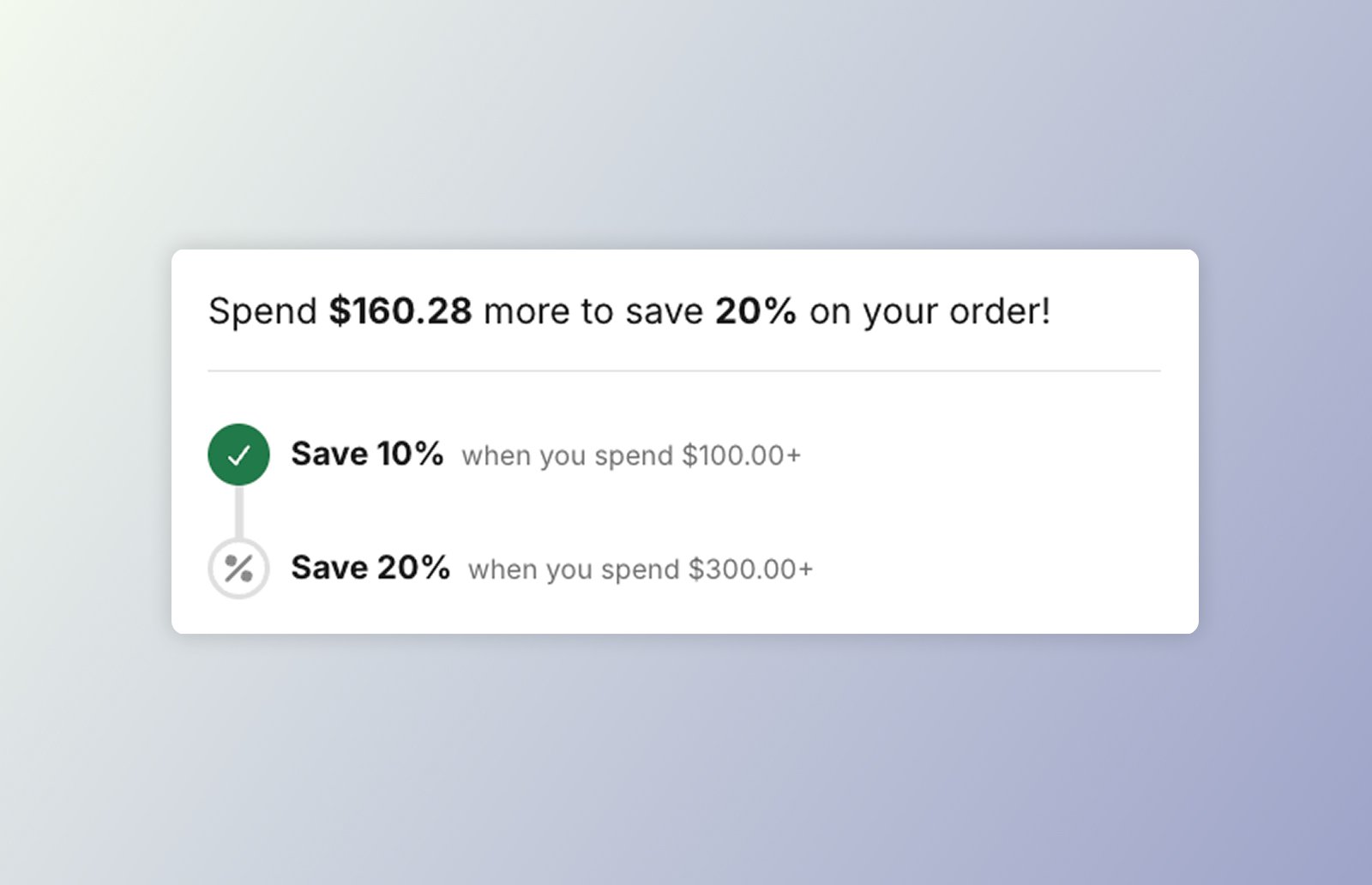
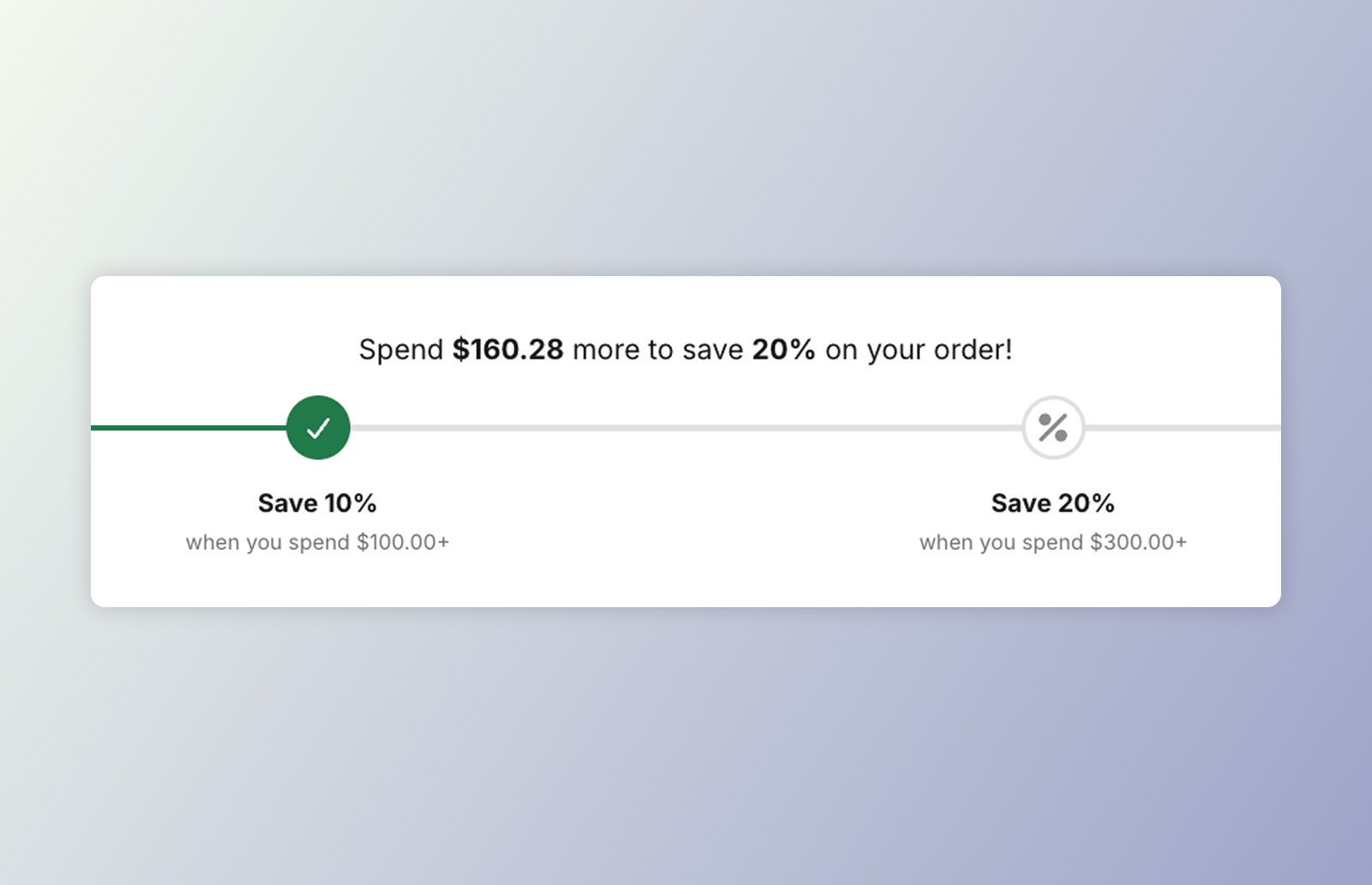 `` shows progress toward an **order-goal** discount's spend tiers from the
cart's items subtotal: a progress track, evenly-spaced tier markers, and a "Spend
**\[amount]** more to save **\[discount]**" message that flips to a success heading once every
tier is met.
It's a **light-DOM** component (like the [discount badge](/components/discount-badge/overview)) — no
shadow DOM and no CSS parts. The Liquid snippet server-renders the full UI so it paints server-side, and the component re-renders **in place** on cart updates — recomputing the
progress fraction, marker states, and message locally, which keeps it theme-agnostic.
**Cart total.** The component drives off the theme's standard `shopify:cart:lines-update`
event, summing the cart's line costs into an items subtotal. When that yields no cart, it
falls back to reading `/cart.js`, so custom-cart configurations are respected. Tier
min-spends are compared against the presentment-currency subtotal with **no currency
conversion** — multi-currency stores get face-value comparisons.
## On this component
Add **DK: Order Goal** in the theme editor and configure it with settings — no code.
Drop `` straight into your theme's Liquid and configure with `data-*`.
The `data-*` attributes, `--dkl-og-*` styling tokens, and Light-DOM classes shared by both.
The tier-change event `` emits.
Both placements need the **Discount Kit Live** app embed enabled, and render identically —
the same defaults back both. See [App blocks vs. Web Components](/components/app-blocks-vs-web-components)
for how to choose.
## Accessibility
* **Progress bar semantics.** The track carries `role="progressbar"` with `aria-valuemin`,
`aria-valuemax`, `aria-valuenow`, and a money-formatted `aria-valuetext` (e.g. "$40.00 of
$100.00"), so assistive tech reports real progress toward the goal rather than a bare
percentage.
* **Live progress message.** The "Spend \[amount] more…" headline (and the success message)
is an `aria-live="polite"` region, so it's announced as the cart total changes.
* **State beyond colour.** Met tiers are marked with both an `--active` class and a check
icon, not colour alone. Keep `--dkl-og-progress-color` and the marker colours at sufficient
contrast when restyling.
`` shows progress toward an **order-goal** discount's spend tiers from the
cart's items subtotal: a progress track, evenly-spaced tier markers, and a "Spend
**\[amount]** more to save **\[discount]**" message that flips to a success heading once every
tier is met.
It's a **light-DOM** component (like the [discount badge](/components/discount-badge/overview)) — no
shadow DOM and no CSS parts. The Liquid snippet server-renders the full UI so it paints server-side, and the component re-renders **in place** on cart updates — recomputing the
progress fraction, marker states, and message locally, which keeps it theme-agnostic.
**Cart total.** The component drives off the theme's standard `shopify:cart:lines-update`
event, summing the cart's line costs into an items subtotal. When that yields no cart, it
falls back to reading `/cart.js`, so custom-cart configurations are respected. Tier
min-spends are compared against the presentment-currency subtotal with **no currency
conversion** — multi-currency stores get face-value comparisons.
## On this component
Add **DK: Order Goal** in the theme editor and configure it with settings — no code.
Drop `` straight into your theme's Liquid and configure with `data-*`.
The `data-*` attributes, `--dkl-og-*` styling tokens, and Light-DOM classes shared by both.
The tier-change event `` emits.
Both placements need the **Discount Kit Live** app embed enabled, and render identically —
the same defaults back both. See [App blocks vs. Web Components](/components/app-blocks-vs-web-components)
for how to choose.
## Accessibility
* **Progress bar semantics.** The track carries `role="progressbar"` with `aria-valuemin`,
`aria-valuemax`, `aria-valuenow`, and a money-formatted `aria-valuetext` (e.g. "$40.00 of
$100.00"), so assistive tech reports real progress toward the goal rather than a bare
percentage.
* **Live progress message.** The "Spend \[amount] more…" headline (and the success message)
is an `aria-live="polite"` region, so it's announced as the cart total changes.
* **State beyond colour.** Met tiers are marked with both an `--active` class and a check
icon, not colour alone. Keep `--dkl-og-progress-color` and the marker colours at sufficient
contrast when restyling.