> ## Documentation Index
> Fetch the complete documentation index at: https://discountkit.app/llms.txt
> Use this file to discover all available pages before exploring further.
# Discount Price
> Theme-agnostic price display that reacts to volume tiers and variant changes
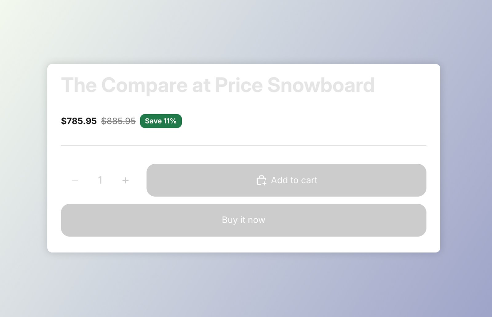 `` renders a product's price in its own shadow DOM rather than hijacking the
theme's price element — so it fully controls the markup and styling. It's
**event-driven**: it has no direct reference to the [volume picker](/components/volume-picker/overview),
but reacts to the tier-change events the picker emits.
* When a [volume tier](/components/volume-picker/overview) is selected (matched by product id), it
shows the **discounted price** as the main amount and the **original price struck
through** — the compare-at when the variant is on sale, otherwise the regular price.
Deselecting reverts to the base price.
* On a **variant change** it updates the base price and re-applies the active tier,
recomputing the discount off the new variant's price (sale-priced variants included).
While a tier is active the component sets `data-dkl-discounted` on itself, so CSS can
colour the discounted price distinctly. An optional **savings badge** shows how much the
shopper saves.
## On this component
Add **DK: Price** in the theme editor and configure it with settings — no code.
Drop `` straight into your theme's Liquid and configure with `data-*`.
The `data-*` attributes, `--dkl-*` styling tokens, and CSS parts shared by both.
The tier-change and variant events `` reacts to.
Both placements need the **Discount Kit Live** app embed enabled, and render identically —
the same defaults back both. See [App blocks vs. Web Components](/components/app-blocks-vs-web-components)
for how to choose.
## Accessibility
* **Labelled amounts.** Each amount is preceded by a visually-hidden label (`::part(vh)`) —
"Price" for the main amount, "Regular price" for the struck-through compare-at — so screen
readers can tell the live price from the original. Don't remove or repurpose `::part(vh)`.
* **Live price announcements.** When a variant or tier changes, the new price is announced
through a managed `aria-live="polite"` region — concise, e.g. "£18.00, was £24.00, Save
25%". It fires only on a change, never on initial load, and lives on a dedicated region
rather than the host (a live region wrapping shadow DOM is monitored unreliably across
screen readers).
* **Contrast.** When restyling the savings badge, keep `--dkl-price-savings-color` and
`--dkl-price-savings-background` at sufficient contrast.
`` renders a product's price in its own shadow DOM rather than hijacking the
theme's price element — so it fully controls the markup and styling. It's
**event-driven**: it has no direct reference to the [volume picker](/components/volume-picker/overview),
but reacts to the tier-change events the picker emits.
* When a [volume tier](/components/volume-picker/overview) is selected (matched by product id), it
shows the **discounted price** as the main amount and the **original price struck
through** — the compare-at when the variant is on sale, otherwise the regular price.
Deselecting reverts to the base price.
* On a **variant change** it updates the base price and re-applies the active tier,
recomputing the discount off the new variant's price (sale-priced variants included).
While a tier is active the component sets `data-dkl-discounted` on itself, so CSS can
colour the discounted price distinctly. An optional **savings badge** shows how much the
shopper saves.
## On this component
Add **DK: Price** in the theme editor and configure it with settings — no code.
Drop `` straight into your theme's Liquid and configure with `data-*`.
The `data-*` attributes, `--dkl-*` styling tokens, and CSS parts shared by both.
The tier-change and variant events `` reacts to.
Both placements need the **Discount Kit Live** app embed enabled, and render identically —
the same defaults back both. See [App blocks vs. Web Components](/components/app-blocks-vs-web-components)
for how to choose.
## Accessibility
* **Labelled amounts.** Each amount is preceded by a visually-hidden label (`::part(vh)`) —
"Price" for the main amount, "Regular price" for the struck-through compare-at — so screen
readers can tell the live price from the original. Don't remove or repurpose `::part(vh)`.
* **Live price announcements.** When a variant or tier changes, the new price is announced
through a managed `aria-live="polite"` region — concise, e.g. "£18.00, was £24.00, Save
25%". It fires only on a change, never on initial load, and lives on a dedicated region
rather than the host (a live region wrapping shadow DOM is monitored unreliably across
screen readers).
* **Contrast.** When restyling the savings badge, keep `--dkl-price-savings-color` and
`--dkl-price-savings-background` at sufficient contrast.