> ## Documentation Index
> Fetch the complete documentation index at: https://discountkit.app/llms.txt
> Use this file to discover all available pages before exploring further.

# Volume Picker

> PDP selector for volume / tiered discounts, one radio card per tier

<Tabs>
  <Tab title="Layout: Cards">
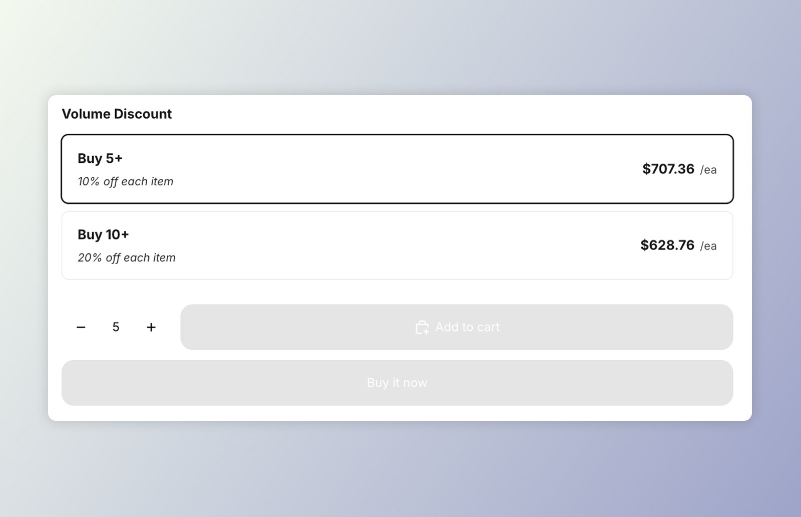
    <Frame caption="DKL Volume Picker component - layout: cards">
      <img src="https://mintcdn.com/discountkit/qPmR0fAEpbjKUETr/images/components/dkl-volume-cards-component.jpg?fit=max&auto=format&n=qPmR0fAEpbjKUETr&q=85&s=67b7f8cbeb0d51f0e96b16481adb3f9b" alt="Image highlighting the DKL Volume Picker component" width="1600" height="1032" data-path="images/components/dkl-volume-cards-component.jpg" />
    </Frame>
  </Tab>

  <Tab title="Layout: Mini-buttons">
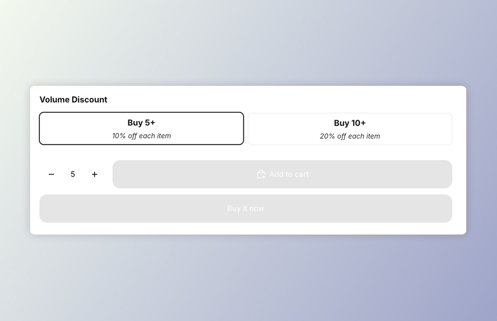
    <Frame caption="DKL Volume Picker component - layout: mini-buttons">
      <img src="https://mintcdn.com/discountkit/qPmR0fAEpbjKUETr/images/components/dkl-volume-mini-component.jpg?fit=max&auto=format&n=qPmR0fAEpbjKUETr&q=85&s=cd4de882410904c5d980544c577796e0" alt="Image highlighting the DKL Volume Picker component - layout: mini-buttons" width="1600" height="1032" data-path="images/components/dkl-volume-mini-component.jpg" />
    </Frame>
  </Tab>
</Tabs>

`<dkl-volume-picker-radio-groups>` is a product-page selector for volume discounts. Each
tier ("Buy 3+", "Buy 5+"…) is a radio card. The radio inputs live in **light DOM** so they
join the product form, and project into the component's shadow DOM through a `<slot>`; the
shadow holds the title and layout.

Selecting a tier:

* emits `discount-kit-live:volume-discount:tier-change`, consumed by
  [`<dkl-price>`](/components/price/overview);
* optionally updates the theme's **native price** element (when enabled), drawing the
  discounted unit price with a synthetic strikethrough;
* optionally syncs the theme's **quantity selector** to the tier's quantity.

Tiers (quantity, discount type/amount, pre-computed unit price) are server-rendered onto
each radio as `data-dkl-*` attributes, which the component reads.

## On this component

<CardGroup cols={1}>
  <Card title="App block" icon="puzzle-piece" href="/components/volume-picker/app-block" horizontal>
    Add **DK: Volume Groups** in the theme editor and configure it with settings — no code.
  </Card>

  <Card title="Web Components" icon="code" href="/components/volume-picker/web-component" horizontal>
    Drop `<dkl-volume-picker-radio-groups>` straight into your theme's Liquid and configure with `data-*`.
  </Card>

  <Card title="Styling & Data Attributes" icon="palette" href="/components/volume-picker/styling-and-data" horizontal>
    The `data-*` attributes, `--dkl-*` styling tokens, CSS parts, and light-DOM classes shared by both.
  </Card>

  <Card title="Events" icon="bell" href="/components/volume-picker/events" horizontal>
    The tier-change event `<dkl-volume-picker-radio-groups>` emits.
  </Card>
</CardGroup>

<Info>
  Both placements need the **Discount Kit Live** app embed enabled, and render identically —
  the same defaults back both. See [App blocks vs. Web Components](/components/app-blocks-vs-web-components)
  for how to choose.
</Info>

## Accessibility

* **Native form semantics.** Each tier is a real `<input type="radio">` wrapped in a
  `<label>`, grouped in a `role="radiogroup"` inside a `<fieldset>`/`<legend>`. So keyboard
  users get native arrow-key navigation between tiers, the whole card is a click target, and
  the selection participates in the product form.
* **Labelled group.** The radiogroup is labelled by the title (`aria-labelledby`), falling
  back to an `aria-label` of "Volume discount options" when no title is shown.
* **Unavailable tiers are disabled.** On a sold-out or excluded variant the tier inputs
  render `disabled`, so they're skipped in the tab/arrow order rather than offering a
  dead-end selection.
* **Selection announcements.** Selecting or clearing a tier is announced through a managed
  `aria-live` region ("… selected" / "Volume discount removed").