

<dkl-order-goal> — the data-* attributes that drive its
behaviour, the --dkl-og-* tokens that style it, and the Light-DOM classes you can target.
The app block settings map onto these; on a custom
element you set them directly.
Using this reference with the app blockWhen you place the DK: Order Goal app block, it renders
its own
<dkl-order-goal> and writes these values for you — so what applies depends on the
kind of override:Data attributes — No:
The block sets every data-* itself, from its App block settings and the resolved discount.
Adding data-* to your own markup has no effect on a block instance; they’re the configuration
surface for the web component only. To change block
behaviour, use its settings.CSS styling tokens — Yes:
They’re CSS custom properties that inherit through the light DOM, so they style a block exactly
like a web component. The block’s colour / radius / spacing pickers just write the matching
tokens into a scoped <style> rule for you. Any token not exposed as a setting (e.g.
--dkl-og-marker-size, --dkl-og-marker-border-color) you can still set yourself from your own CSS —
:root, the embed’s Custom CSS field, or a rule targeting the block.CSS parts — N/A:
This component is light DOM, so there are no CSS parts. Target the
Light-DOM classes below instead — they work the same on a block or a
web component.Data attributes
All optional — on a web component the carrier supplies them by default. Set one to override.metaobject handle
default:"first eligible"
Pick a specific order-goal discount’s carrier. The
discount- prefix is optional; place one
tag per discount to show several.int
default:"carrier (render-time subtotal)"
The baseline cart total.
string
default:"carrier (shop.money_format)"
Money format for JS-rendered amounts.
string
The spend-more message.
[amount] and [discount] are replaced at runtime.string
default:"Winner Winner 🎉"
Heading shown once every tier is met.
string
default:"You've unlocked all available savings"
Content shown once every tier is met.
string
default:"Save [discount]"
Per-tier label;
[discount] is the placeholder.string
default:"when you spend [amount]+"
Per-tier spend line;
[amount] is the placeholder."horizontal" | "stacked"
default:"horizontal"
Layout variant.
stacked arranges markers in a column with the progress bar rotated.CSS styling tokens
- Layout: Stacked
- Layout: Horizontal
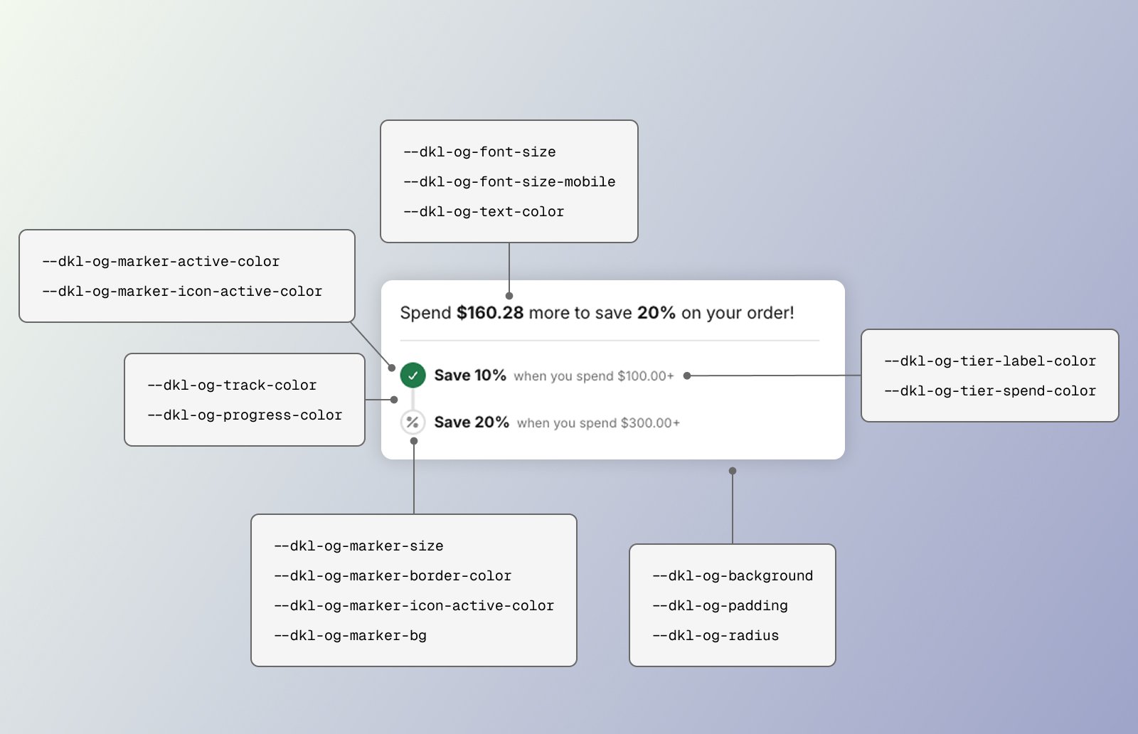
CSS styling tokens for the DKL Order Goal component - layout: stacked
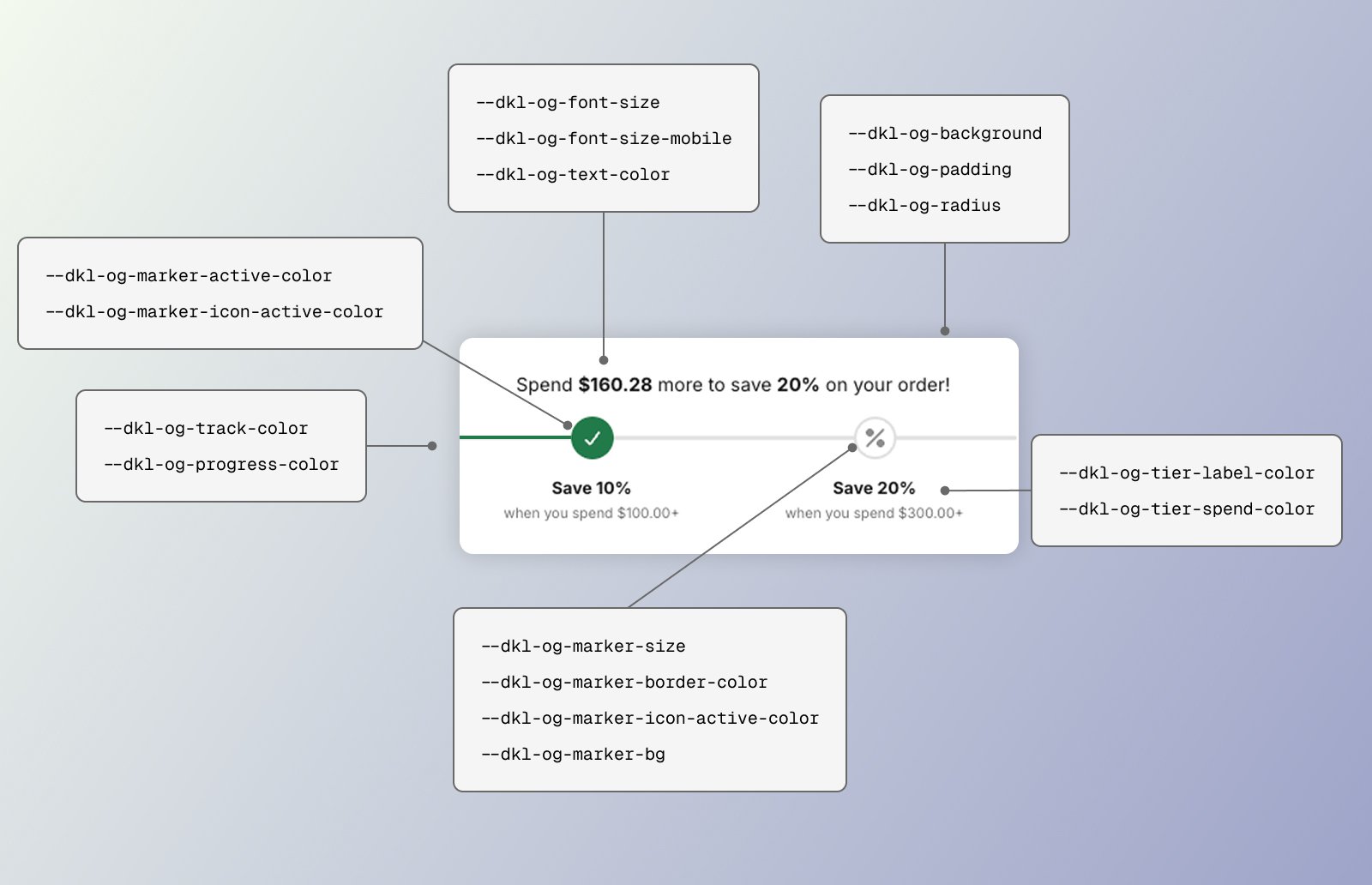
<dkl-order-goal> is styled by a stylesheet loaded site-wide by the embed. Set any token
above the element (:root, the embed’s Custom CSS, an inline style, or the block’s scoped
rule).
default:"0"
Space above the widget (block Margin top).
default:"0"
Space below the widget (block Margin bottom).
default:"var(--dkl-color-background-soft)"
Card background (block Background color).
default:"1rem"
Card padding (block Padding).
default:"var(--dkl-radius)"
Card corners (block Border radius).
default:"inherit"
Base font size — emitted only when block Font sizing is Custom, else inherits the theme.
default:"var(--dkl-og-font-size)"
Base font size at ≤749px (block Font size (mobile), Custom only).
default:"var(--dkl-color-text)"
Card text colour (block Text color).
default:"inherit"
The “Save [discount]” tier label (block Tier label color).
default:"inherit"
The “when you spend [amount]+” tier line (block Tier spend label color).
default:"var(--dkl-color-border)"
Progress track (unfilled bar) colour (block Track color).
default:"var(--dkl-color-accent)"
Progress fill colour (block Progress bar color).
default:"2rem"
Tier marker size.
default:"var(--dkl-color-border)"
Inactive marker border colour.
default:"var(--dkl-color-background)"
Inactive marker fill (block Icon background (not met)).
default:"var(--dkl-color-accent)"
Active (met) marker fill (block Icon background (met)).
default:"#ffffff"
Active marker check-icon colour.
The marker glyph is set via the
--dkl-og-icon mask — the app block
swaps it for you through its icon image settings; on a web component you set the mask yourself.Light-DOM classes
<dkl-order-goal> is all light DOM — no parts. Target these classes directly.
host
The card (host element).
class
The headline / progress message.
class
The progress bar (with
.dkl-order-goal__progress-track; the fill is the track’s ::before).class
The tier row/column.
class
The wrapper for each tier.
class
The marker dot (met:
.dkl-order-goal__tier-marker--active; the icon glyph is its ::before).class
The wrapper for the tier label.
class
The “Save [discount]” text in the tier label.
class
The “when you spend [amount]+” text in the tier label.
Examples
Restyle the progress fill and markers
Custom messaging
Next steps
App block
Configure these via theme-editor settings.
Web Components
Set these directly on the tag.